
OCC Rainbow Stamping

By Cards, Planner Stationary & Accessories

Hi All,

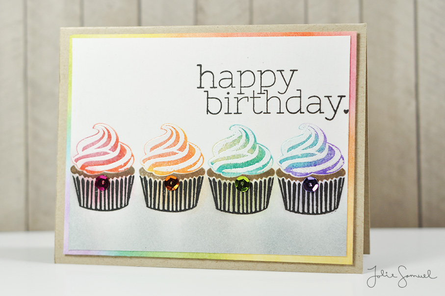
I’m back with another technique in rainbow card making to share with you. For this card, I used stamps to create a rainbow effect on the cupcakes. If you look carefully at the icing on the cupcakes you’ll notice that there is a gradient of colors to each one. The first has reds and oranges, the second has orange and yellow, the third has yellow and green, and the last one has blue and purple. The stamps were first pressed into the lighter shade and rolled into the darker shade to create a seamless blending.

To emphasize the coloring even further I added a hue of shading to the cupcake liner and put sequins on the bottom that coordinates with the coloring of the icing for the individual cupcake. To ground the whole image (so it doesn’t look like the cupcakes are floating in the air) I added some gray shading to the bottom of the card. I also added some white frosting embellishments by embossing a layered stamp onto the rainbow inking – it really brings that frosting image to a whole new level. I wish you could see it in person.

To finish off the card I added what I felt was the most suiting sentiment – ‘happy birthday’! I mean who wouldn’t want one of these cupcakes for their birthday?


OCC Rainbow Maker Stencil Ink Blending

By Cards, Planner Stationary & Accessories

Hi All,

I’m continuing to share cards I created for OCC Rainbow Maker class. This card using a similar technique to previous days but also includes the concept of using white space to draw attention to a focal point on a card. I used a stencil to create the rainbow background and again did a bit of ink blending. I decided to go with a silhouetted plant image to keep the design elements simple.

Next, I wanted to add some texture to the card without adding any additional color (keeping the white space). I used a simple geometric pattern and dry embossed the background. That element really pulled in the shapes of the stencil together to create this card.

I didn’t include a sentiment on this card – I liked the simplicity of it and liked how it could be used to send any sentiment one would choose to use.

Here is another card using a similar technique. This time I kept the stencil to one side of the card and used a sentiment to hold the white space.

Both cards are unique and the rainbow inking really does pack a punch.

I hope you enjoyed taking a peek at these projects and I’ll be back real soon with another project to share with you.

OCC Rainbow Maker Ink Blending with Stencils

By Cards, Planner Stationary & Accessories

Hi All,

Today’s card using the technique of ink blending but this time in a double layer. The first layer was a light blending across the entire panel (which you can see in the background). I kept things soft and almost pale in comparison to my second layer of blending.

Once that layer was done I used a small dotted stencil and went over the panel once more, this time using more ink and keeping the color concentrated. When I removed the panel I was left with these results. I added a bit of water to the background once again to get some small bleached marks and then added a simple banner sentiment.

You can see the many similarities between this card and the previous day. There was only a minor change in that I added a stencil. I like the look of the stencil and feel like I may revisit this technique but next time only uses a stencil. We’ll see what kind of results that gives. Stay tuned to see!

Thanks for stopping by and I’ll see you again real soon with another rainbow card!


OCC Rainbow Maker Ink Blending

By Cards, Planner Stationary & Accessories

Hi All,

Welcome back! I hope you all are having a great end to the summer season. One thing I wanted to do this summer was take a class on card designing and learn a few tips and tricks to add to my repertoire. I have taken several classes at OnlineCardClasses.com and thought it would be great to take another. The class I chose to take was called Rainbow Maker. Now, I’m not a big fan of rainbows or blocks of color on cards. I typically like to keep things simple by adding a pattern or image with minimal coloring. I don’t know why, but I always feel like if there’s more color, things start looking too ‘busy’ and I don’t know where to concentrate my eyes.

I decided to give the class a try and oh my gosh am I glad I did! There was just a ton to learn and think about. For day 1 we focused on ink blending. I have a bunch of little distress inks from Tim Holtz and decided to break those out and try my hands at blending colors together and creating a seamless look. This card uses 6 different ink colors and are blended together. To get the distressed look I added some splashes of water onto the blended panel and let them it sit for a few seconds. I then used a dry paper towel to pick up the pooled ink and was left with those white bleached marks.

To finish off the card I thought I’d use something that felt majestic and choose ‘miracles happen’.

I think it turned out looking somewhat magical. In the spirit of practice makes perfect, I’ll definitely be giving this technique another try. Let’s see what I can come up with next. I’ll see you again real soon with another project. Thanks for stopping by!